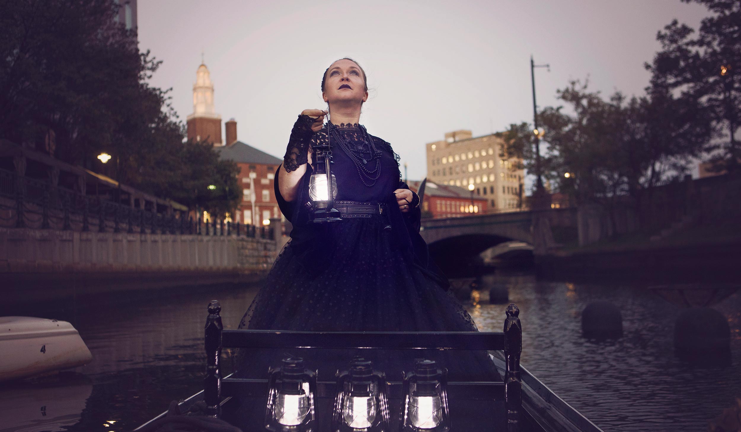
Providence Ghost Tour offers guided walking tours through the historic streets of Providence, introducing visitors to the city’s rich—and haunted—past.
We partnered with Courtney to create various print marketing materials which extend the brand across multiple touchpoints. Having been on Courtney’s Ghost Tours, we were highly interested in helping her get the message out. We designed each piece to reinforce brand awareness while capturing the intrigue and mystery of the tour experience. The materials supports both visitor engagement and local promotion — bringing the story of Providence’s ghostly history to life in a visually compelling way.
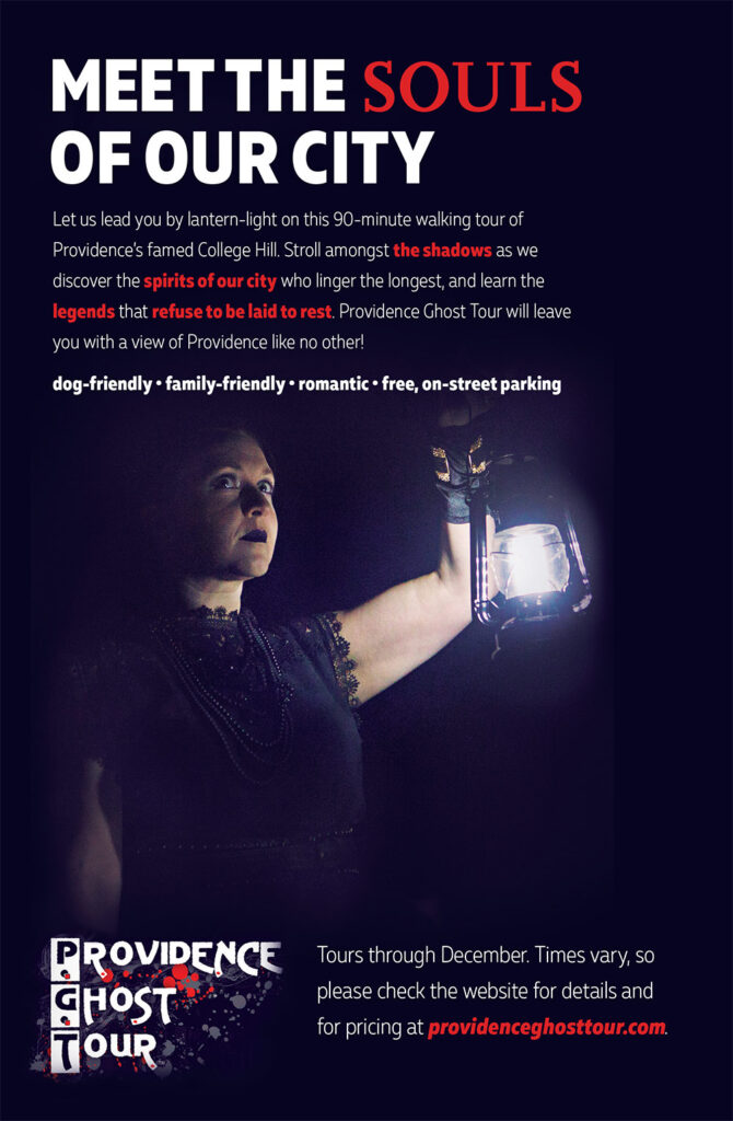
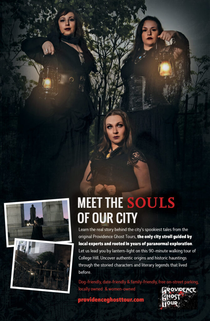
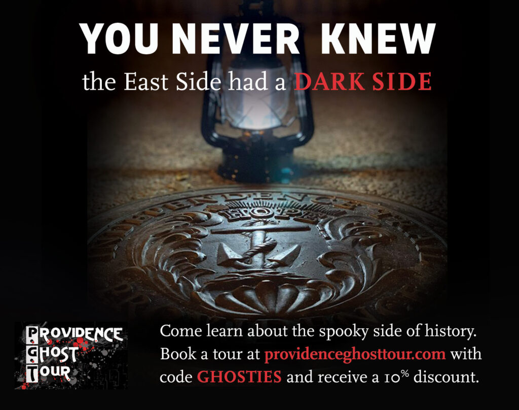
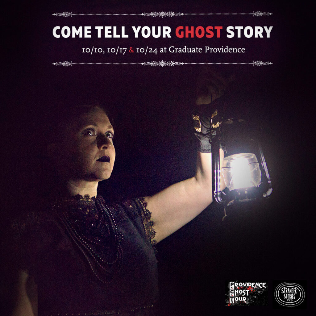
With only a brief moment to capture attention, we designed various ads to stand out as viewers flipped through pages or scrolled through social media. We enhanced client-supplied photography to draw the eye and creating intrigue.
With a Providence-centric focus, we tailored ad messaging to position the experience as something local, authentic, and worth seeking out — encouraging viewers to pause, engage, and visit the website to learn more about the tour.
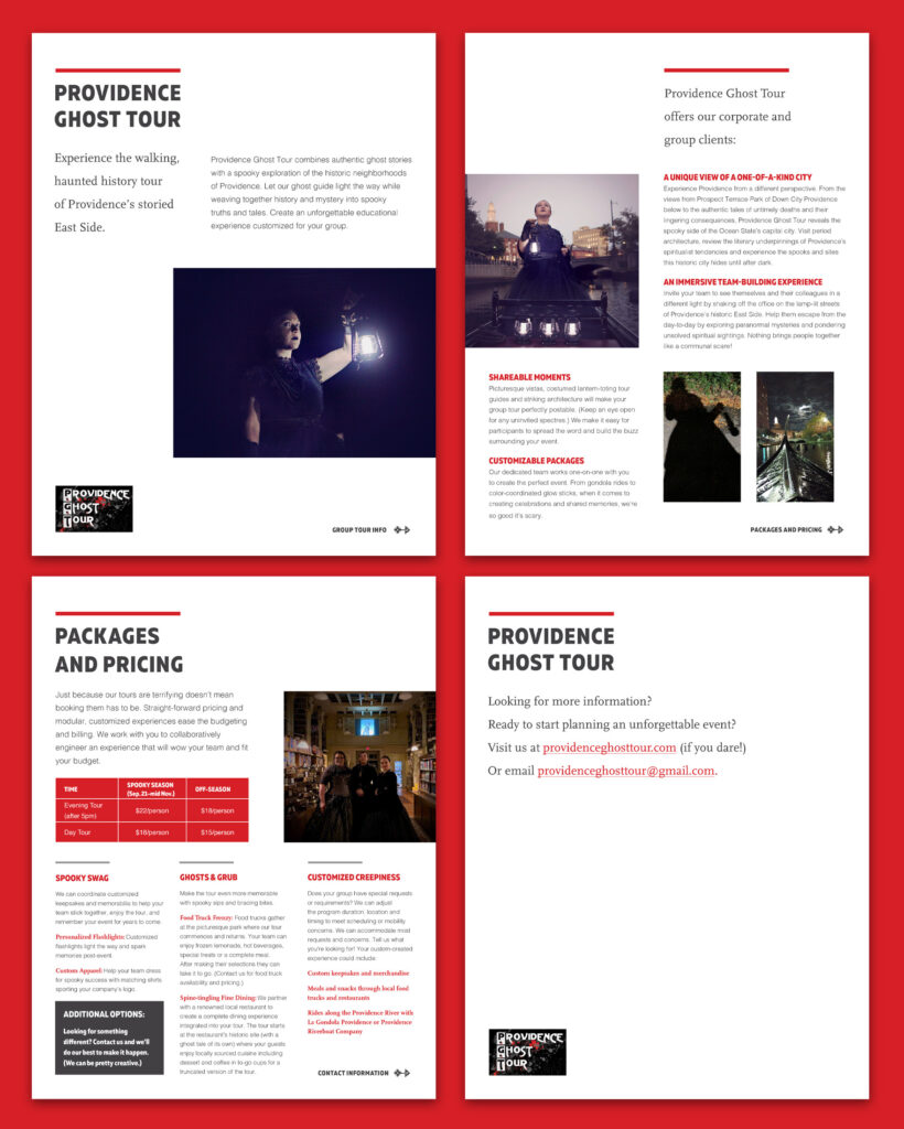
To support expanded outreach beyond tourism, Courtney needed a digital sales kit to position Providence Ghost Tour as a unique and flexible experience for group events, corporate outings, and convention visitors. We designed and created a professional piece to be shared digitally with decision-makers of organizations working with tourism partners or those who inquired directly.
The kit serves as both an introduction and a persuasive overview of available offerings. The design balances corporate professionalism with personality — remaining clean while still capturing the character of the brand. This marketing tool supports direct outreach, helps build partnerships, and makes it easy for organizers to envision the tour as part of their event programming.
We designed a rack card to be distributed in high-traffic, tourism-focused locations to draw in new customers. We placed the logo prominently at the top of the card to ensure visibility in rack displays, while the front features enhanced imagery paired with subtle dark visual elements. The card captures attention instantly, encouraging new visitors to turn it over to learn more about the tour experience.